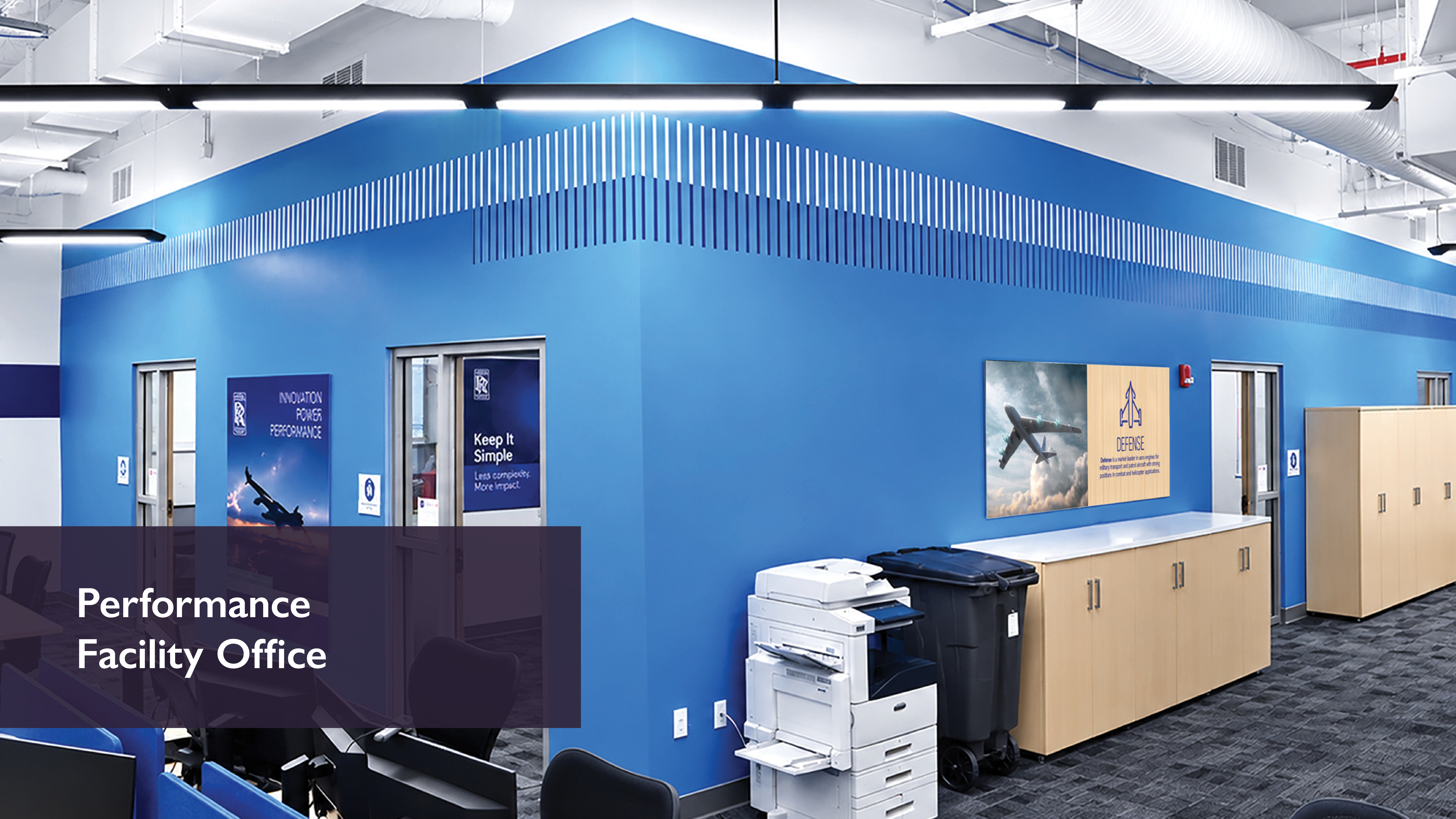
The Rolls-Royce Performance facility is a premier site for manufacturing some of the world’s most historic and technologically advanced aerospace engines.
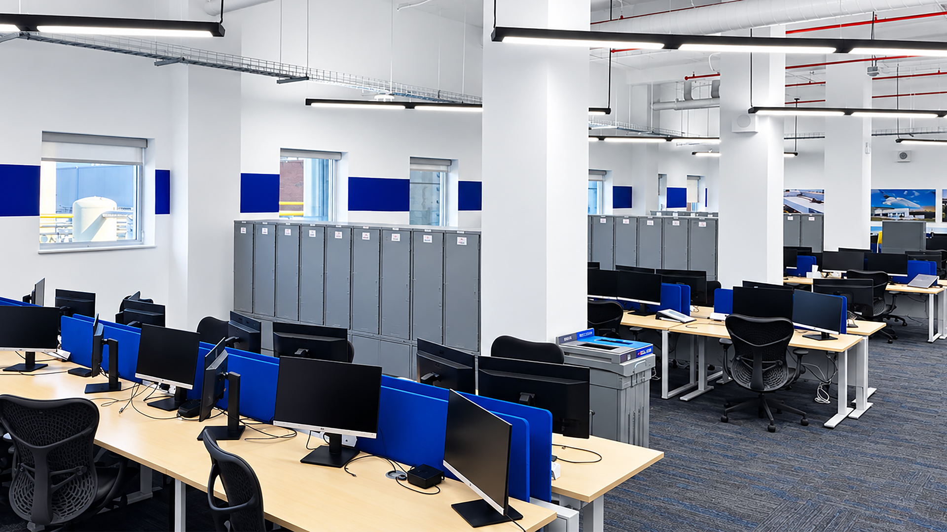
As part of a facility upgrade, an open area on the upper level was converted into office space. The sightline through the space was dominated by multiple wide structural pillars, creating both a challenge and an opportunity for environmental branding.
My approach was to strategically distribute brand color, imagery, and graphic elements throughout the space, creating a visual rhythm that would engage employees and visitors as they moved through the office. Rather than treating the large area as a single canvas, I developed a series of intentional visual interactions that worked together to tell the Rolls-Royce story.
▾ As seen below, I accomplished this through a combination of SEG-framed imagery, painted surfaces, wood treatments, and dimensional murals.
Subtle applications of brand color break up the extensive white space and transform what could have been a cold, utility environment into a
modern workplace with a distinctly Rolls-Royce character.
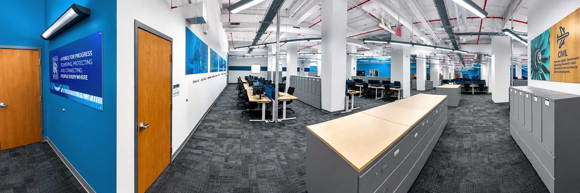
The main entry establishes the visual language for the office. I treated the wall with a painted section of brand blue and incorporated a kiss-cut vinyl application of the Rolls-Royce brand equity shape, “Progress Bars.” Visitors entering the space are immediately greeted by a strong section of brand color, establishing a visual connection to the Rolls-Royce identity and setting the tone for the environmental graphics throughout the office.
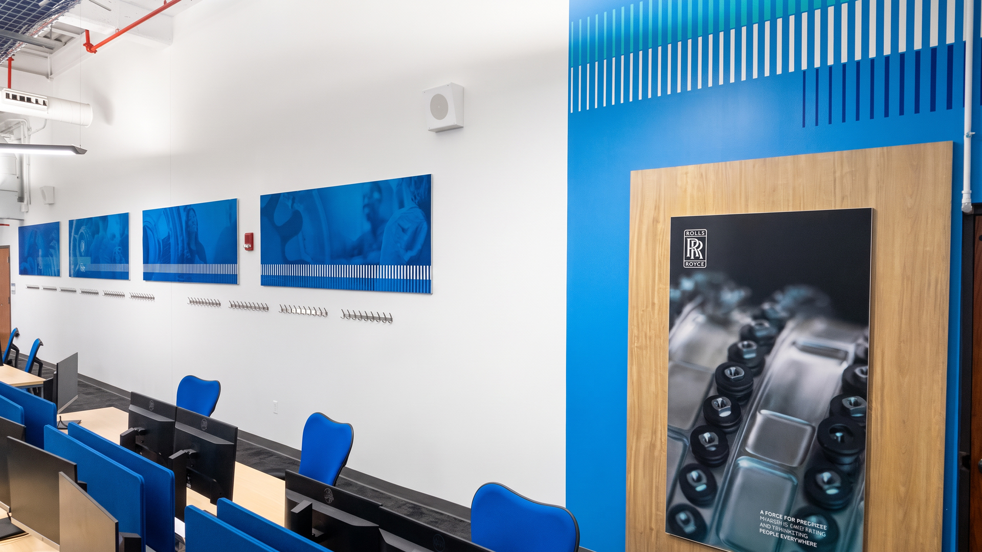
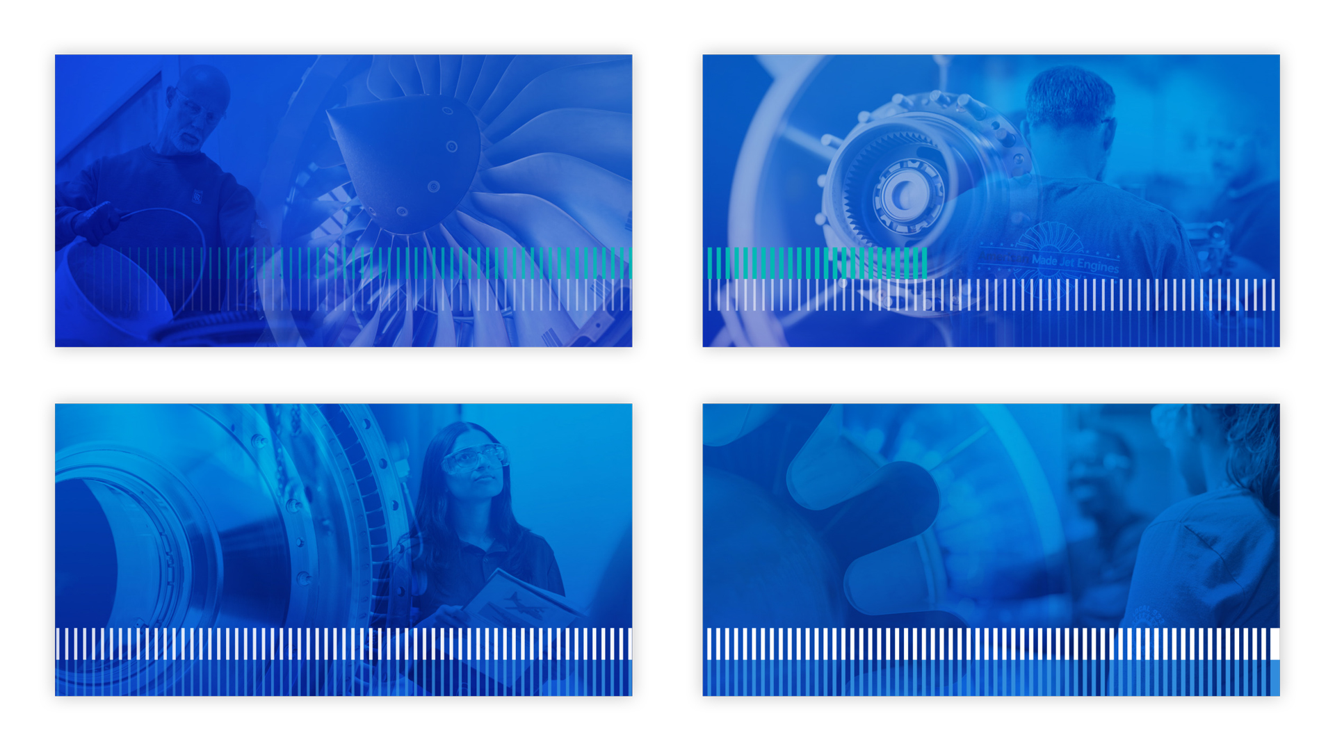
Rolls-Royce is a global organization, with projects and teams spanning multiple facilities, business units, and countries. The company’s “One Rolls-Royce” philosophy emphasizes working together as one connected organization. I used the entry wall to reinforce that idea through four large SEG fabric installations featuring facility personnel working and interacting to develop advanced aerospace technology. The photography brings the people behind the technology into the environment and reinforces the collaborative nature of the organization
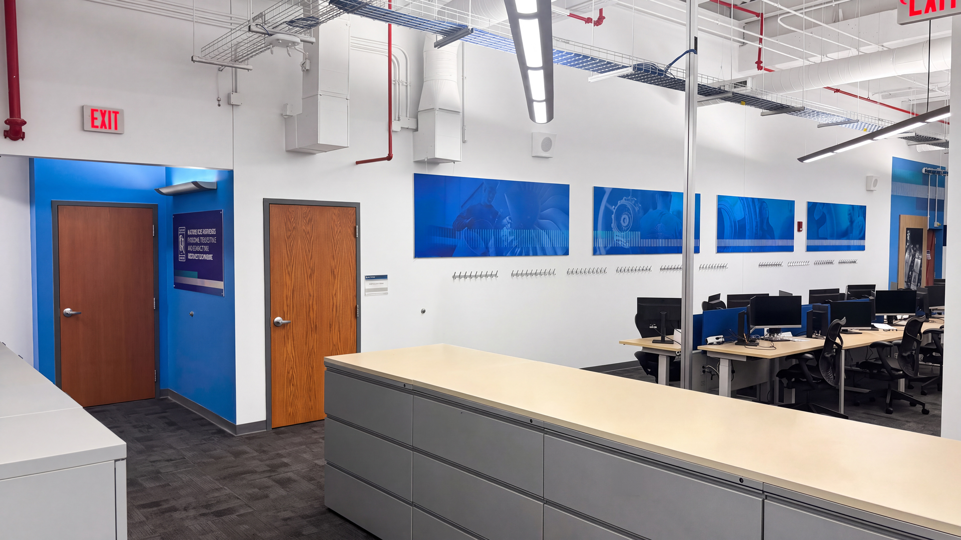
At the opposite end of the office is a highly visible “strikezone”—a prime location for a graphic interaction that could establish a visual destination and lead visitors toward other significant elements within the space.
I used this location to introduce the Rolls-Royce monogram at a large scale, creating a strong branded focal point while maintaining the clean, modern aesthetic of the office.
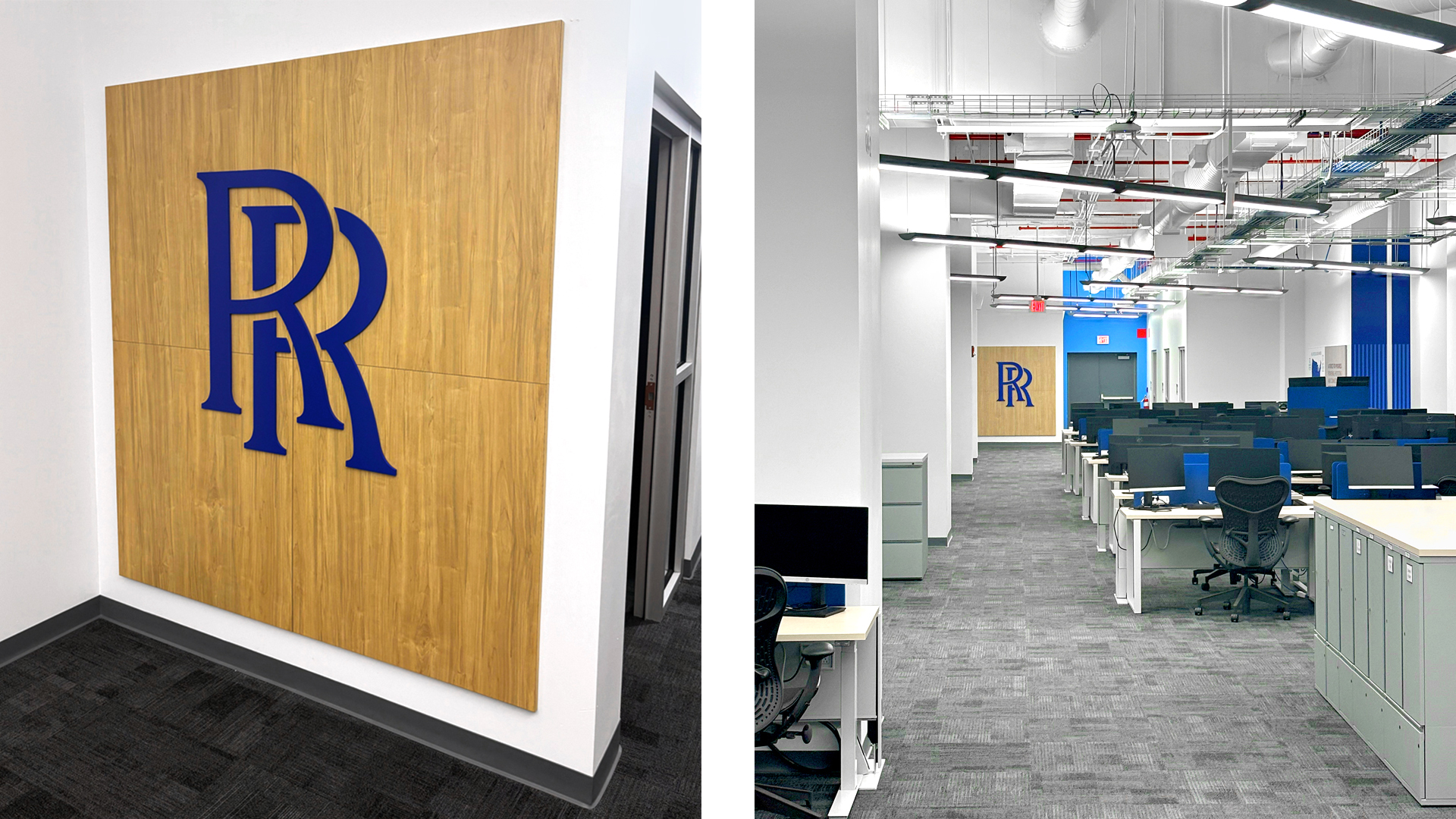
The wood textures used throughout the space extend a visual treatment established in Rolls-Royce exhibit environments. Incorporating these materials into the office creates consistency between temporary event environments and permanent workplace branding. A wall surrounding a fire exit was painted in a secondary brand blue, providing another controlled application of color and helping maintain visual continuity along the primary sightline.
I used this location to introduce the Rolls-Royce monogram at a large scale, creating a strong branded focal point while maintaining the clean, modern aesthetic of the office.
Civil, Defense and Power Systems
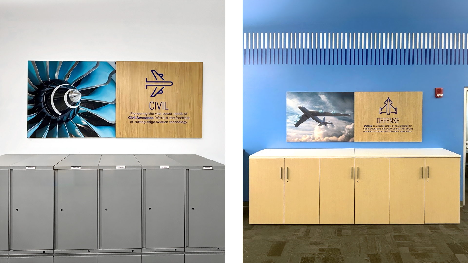
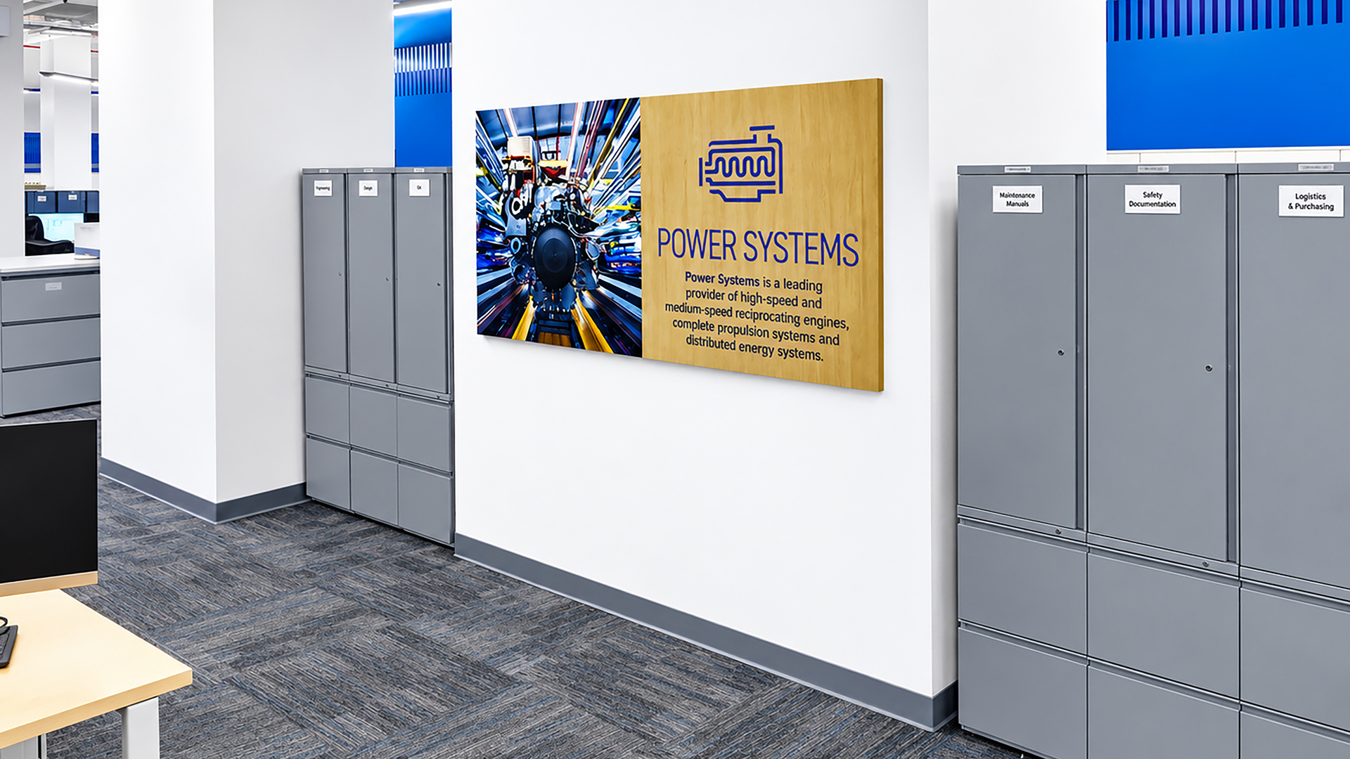
Rolls-Royce is organized around three major aerospace and power segments: Civil, Defense, and Power Systems. I developed three dedicated mural treatments to recognize each segment within the office environment. Each installation combines an SEG fabric image with a wood veneer panel featuring descriptive content. The combination of photography, natural material, and information creates distinct visual moments while maintaining a consistent design language across the three areas.
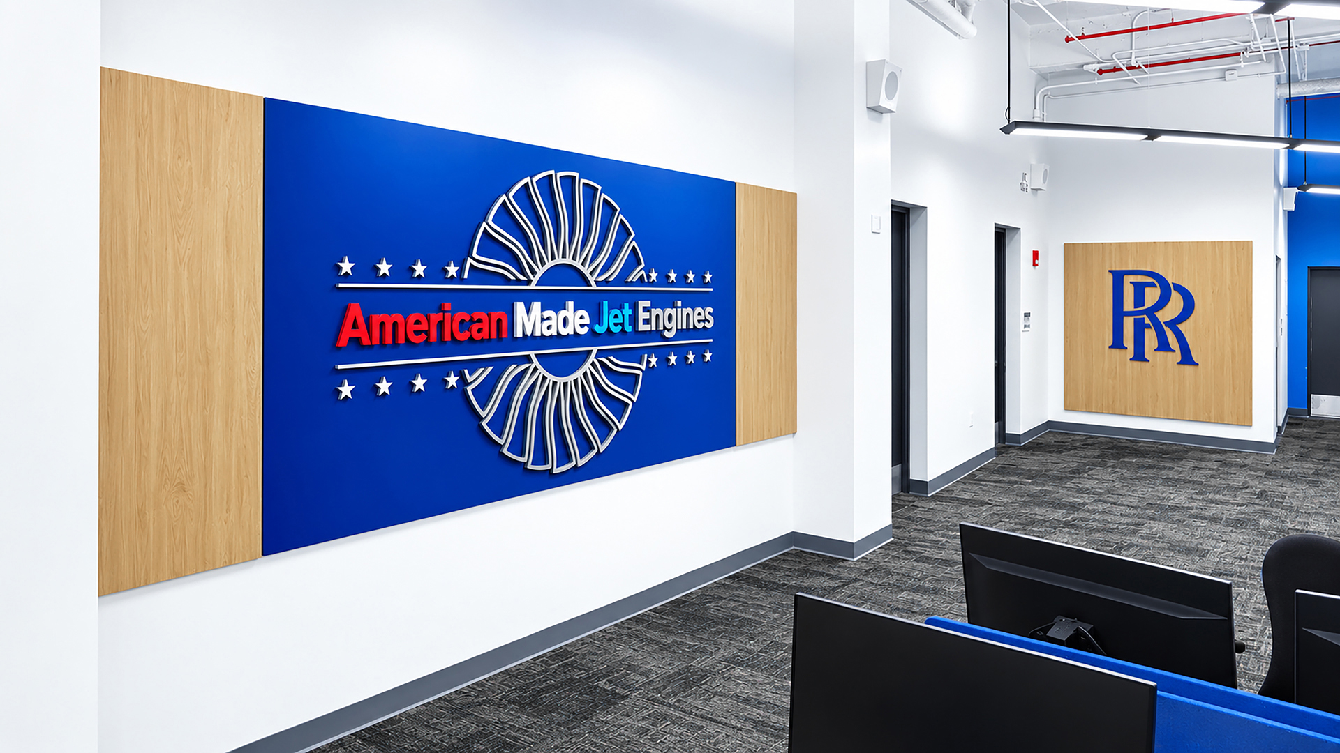
The “American Made Jet Engines” mural is a dimensional interpretation of a logo I originally developed for previous projects. The identity was first created for apparel celebrating our union teams and received such positive internal response that it has since been incorporated into additional internal graphics.
For this application, I translated the identity into a large-scale 3D mural. Similar dimensional treatments are now used throughout several Rolls-Royce facilities in the Indianapolis area, helping establish a recognizable visual language for the workplace environment.
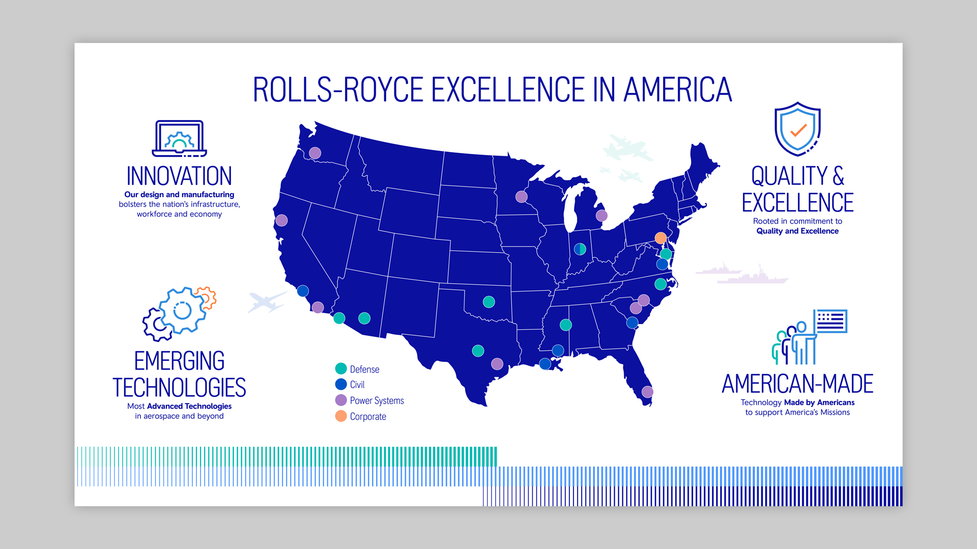
This prominent area combines information and visual storytelling to create an engaging interaction within the office floor plan. An infographic is paired with a large-scale engine mural, creating a corner read-across that draws visitors through the space. The infographic highlights Rolls-Royce locations throughout the continental United States along with four key promotional messages about the company. A wood veneer panel complements the graphic treatment and carries the company tagline.
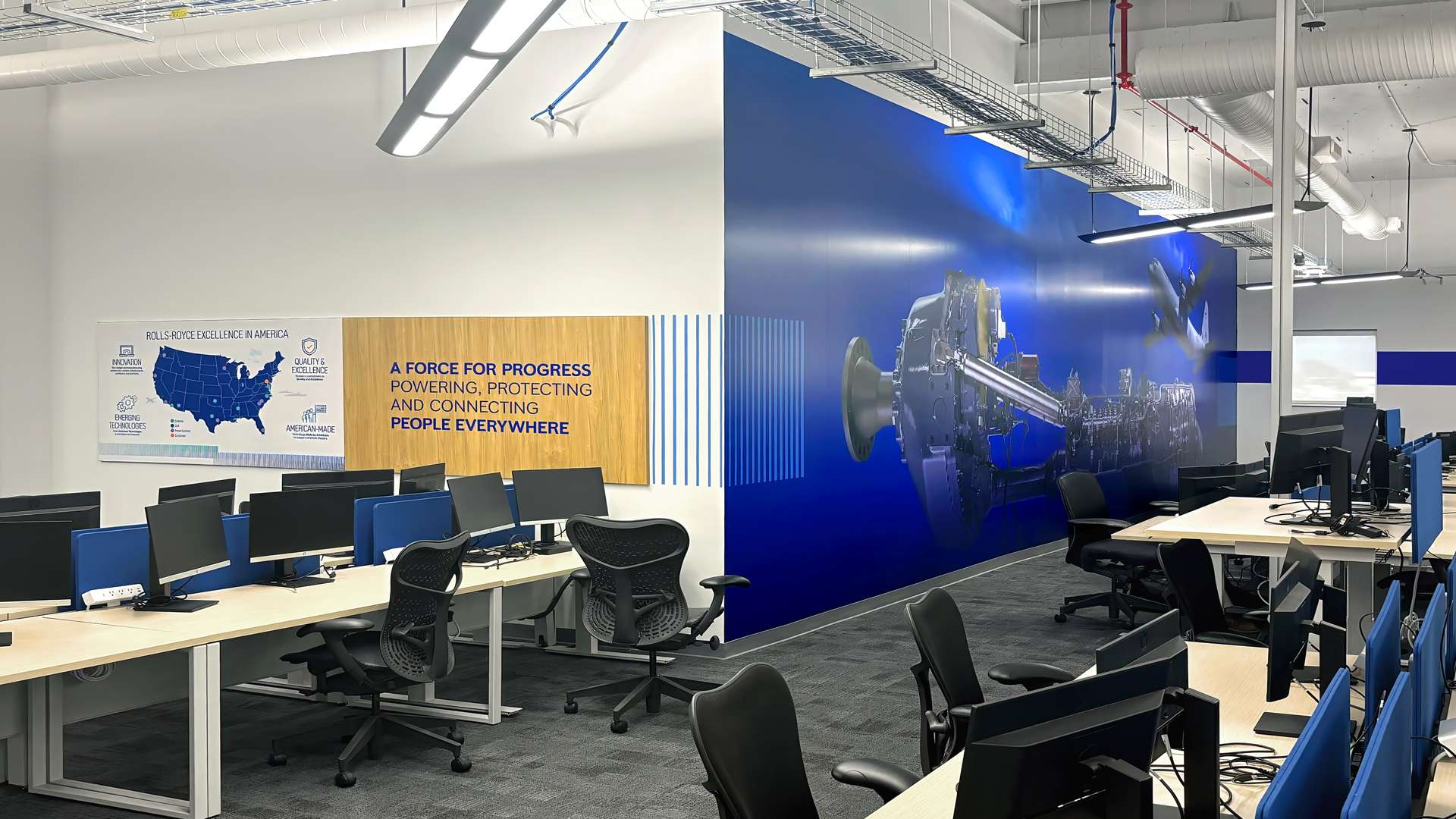
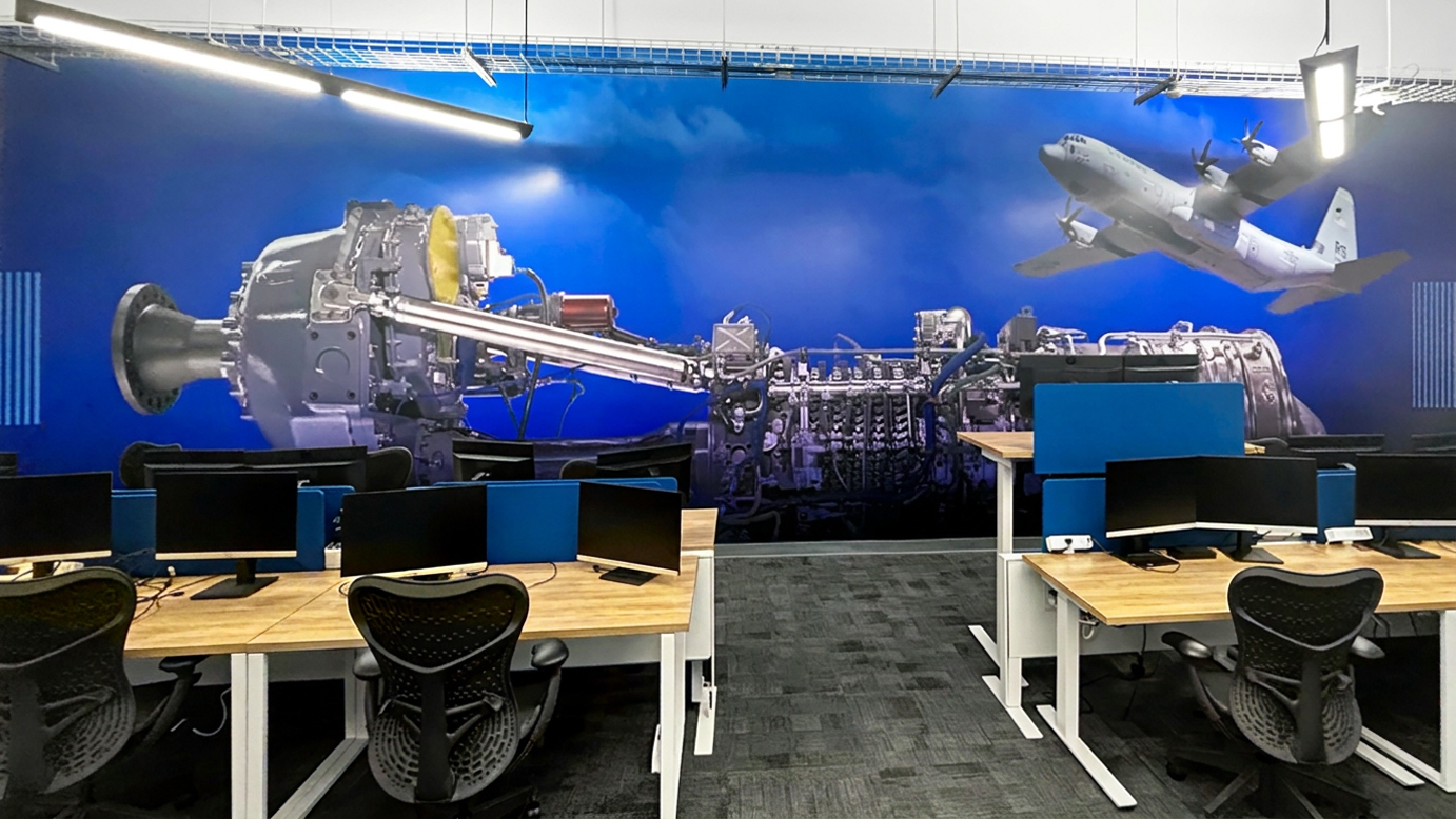
The large engine mural introduces a significant area of brand color into the back of the office sightline. The scale of the installation places one of the company’s historic and powerful engines at the center of the environment while also connecting the technology to one of the aircraft platforms it supports—the C-130J.
The oversized treatment was intentional: it gives the engine a presence that would be difficult to achieve through traditional wall graphics and creates a strong visual destination within the open office.
Walls containing windows on opposite sides of the space were not suitable for major graphic installations. Instead, I used a continuous blue stripe to visually connect these areas and lead the eye toward the next major interaction. This relatively simple application helped maintain the overall design rhythm while introducing another controlled use of brand color. It also supported the larger strategy of breaking up the extensive white space without overwhelming the architecture.
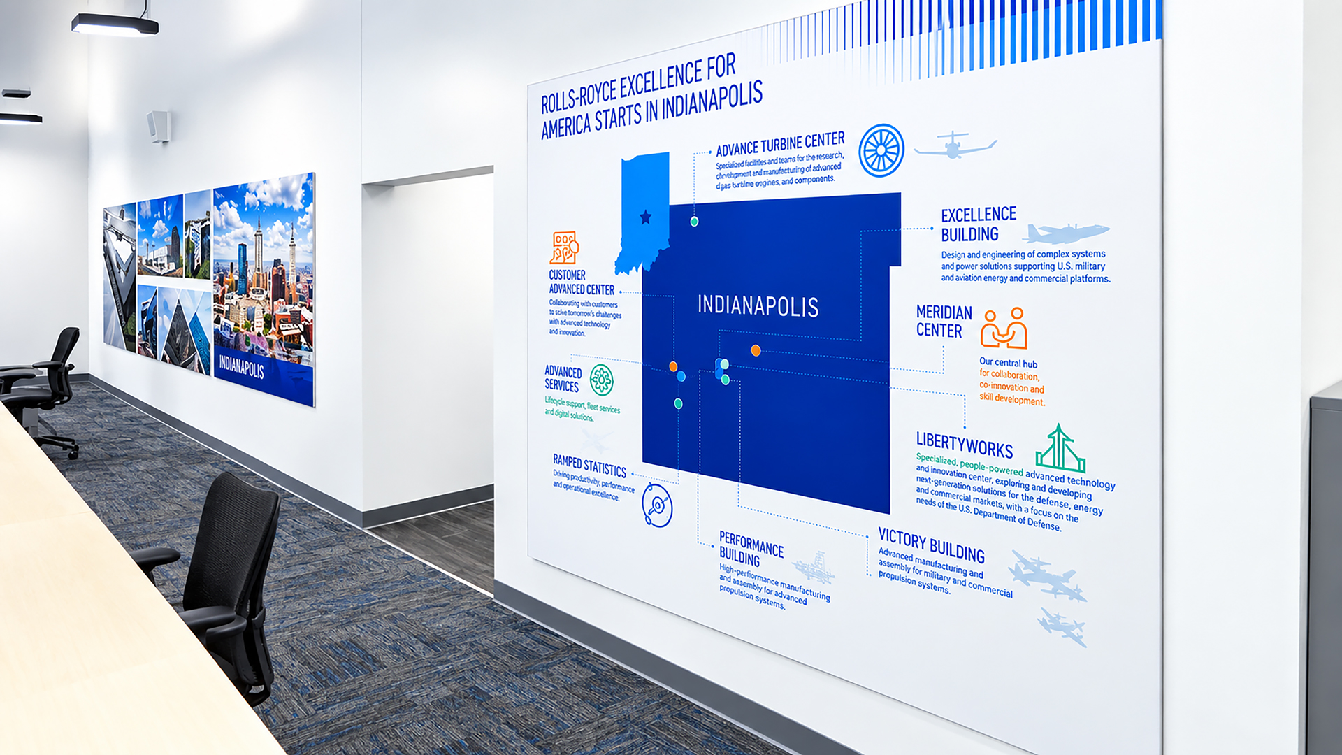
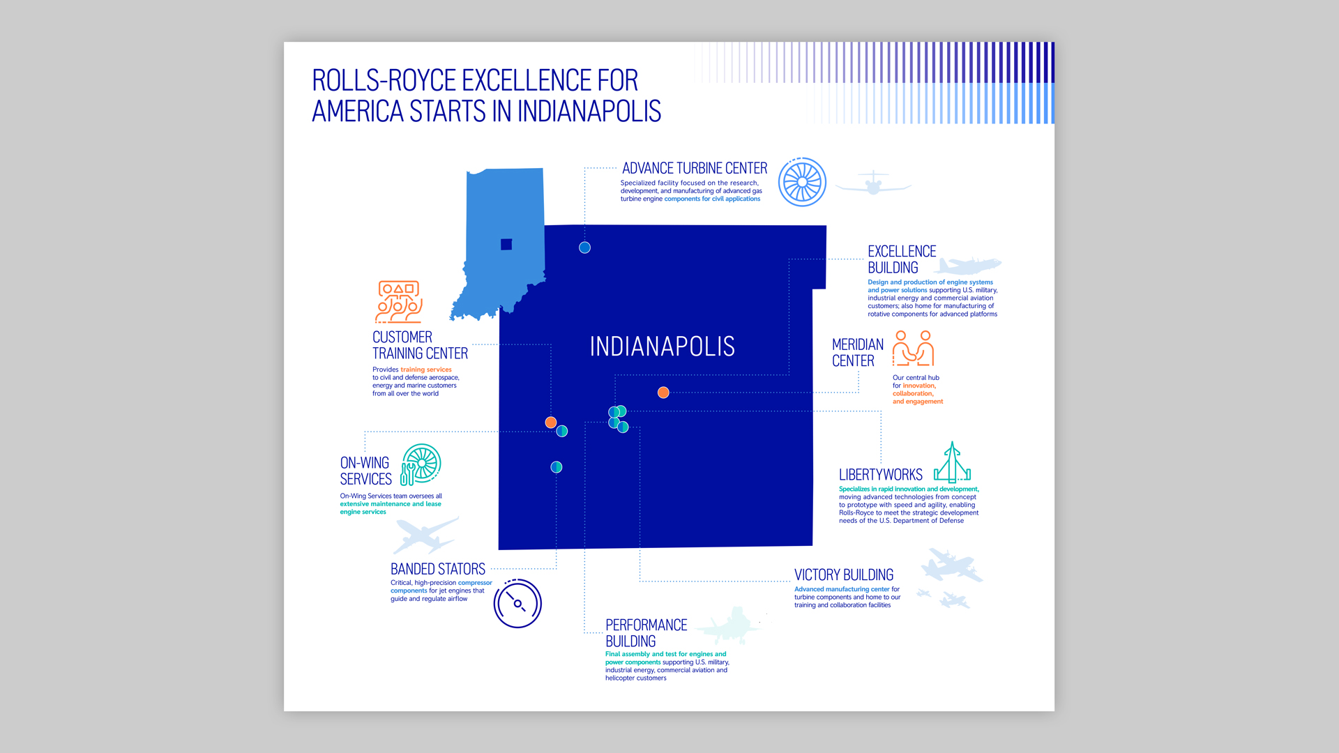
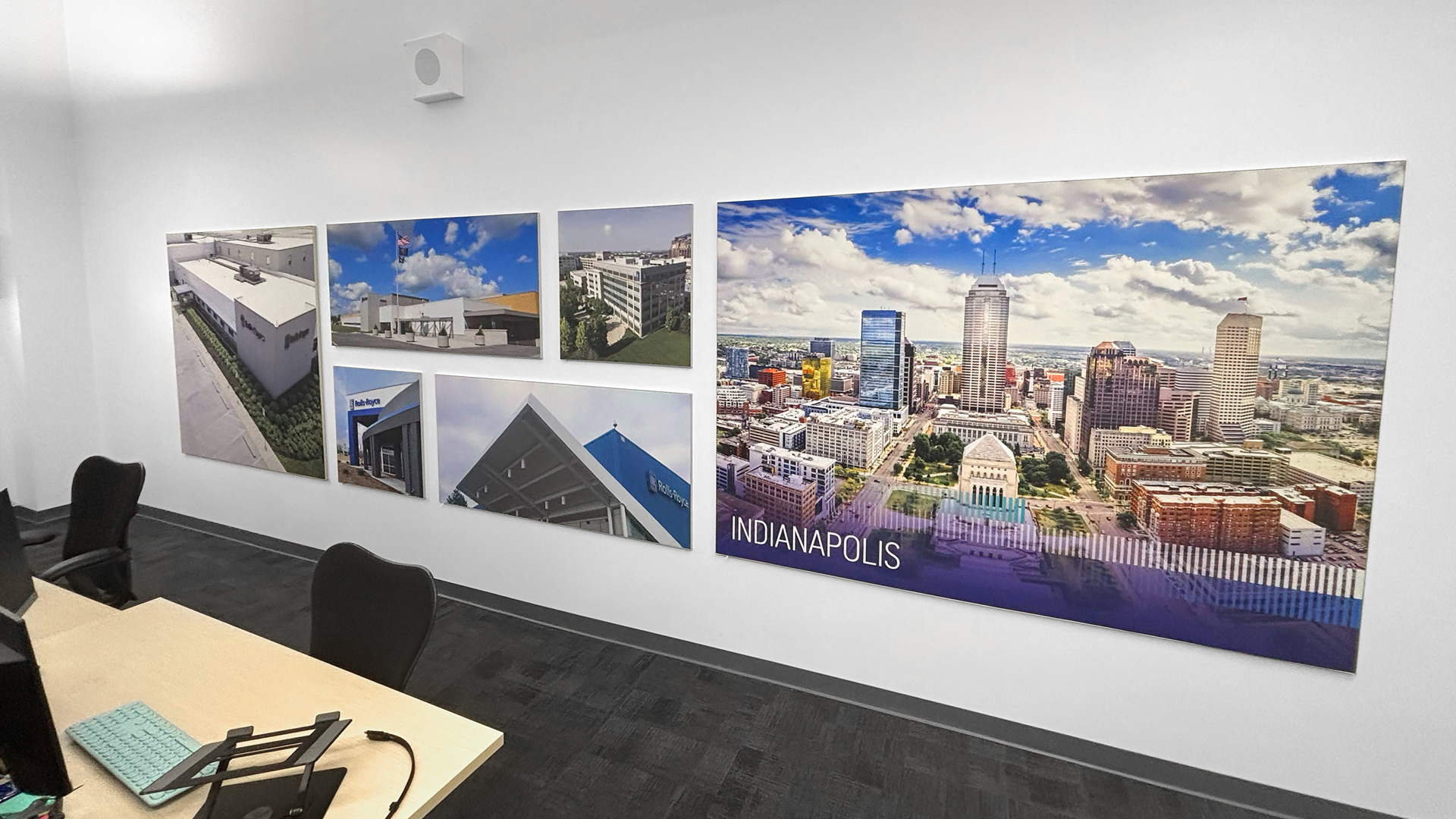
This area visually recognizes several Rolls-Royce facilities throughout the Indianapolis area. I developed an infographic treatment that communicates the primary function and location of each facility, providing employees and visitors with a better understanding of the broader local Rolls-Royce operation.
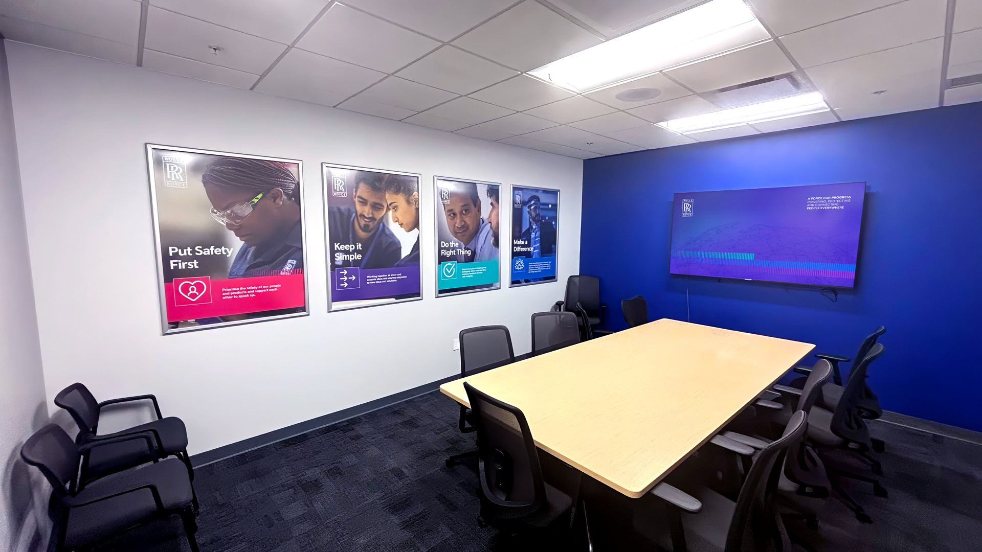
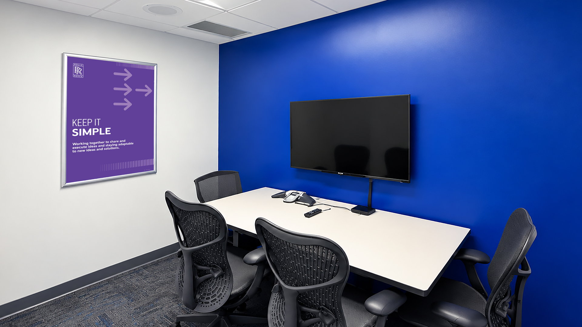
All conference and meeting rooms were treated with brand-blue feature walls and Purpose and Behaviour graphics. These rooms provide smaller-scale branded environments within the larger office while reinforcing the company’s visual identity and workplace principles.
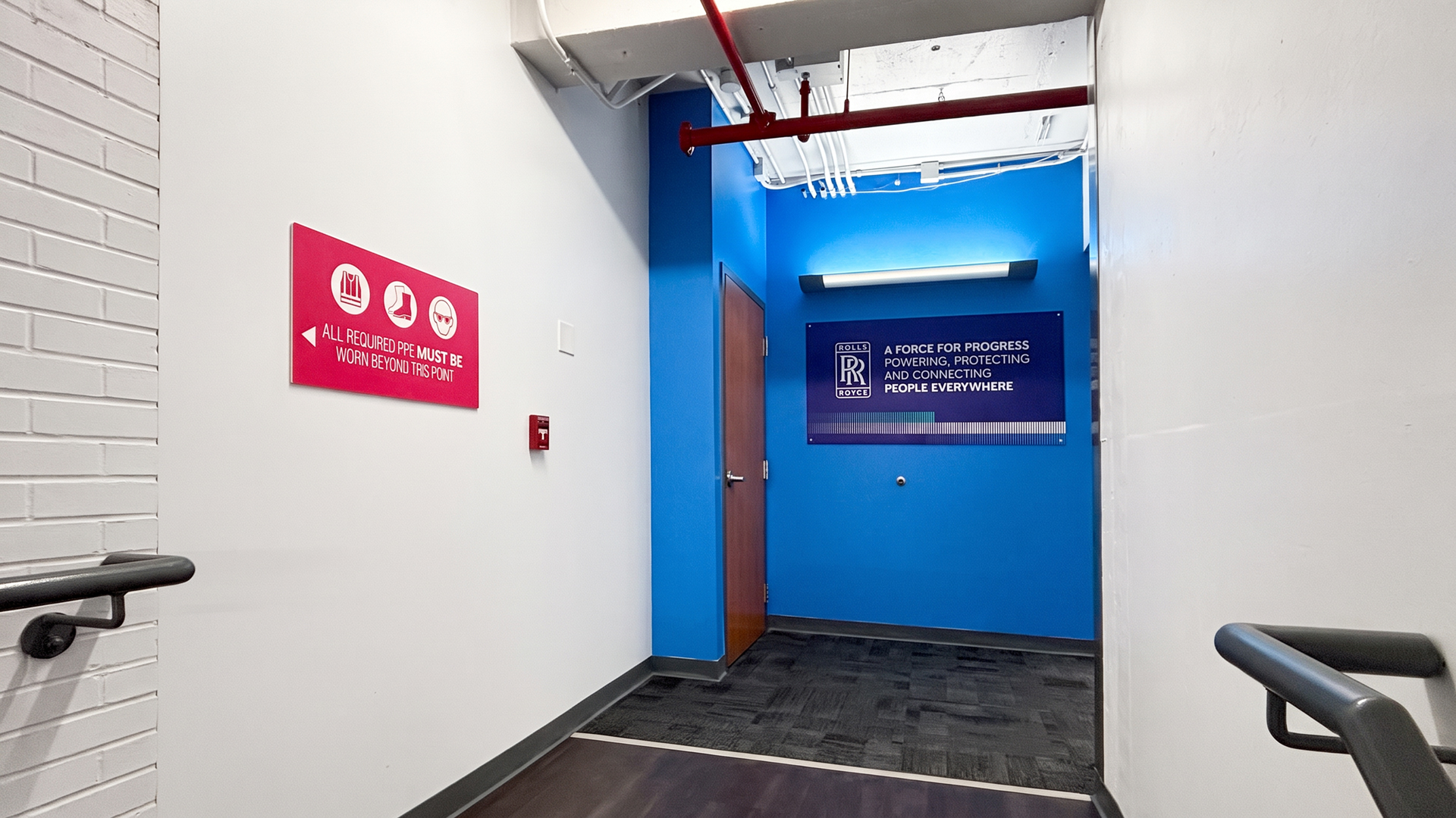
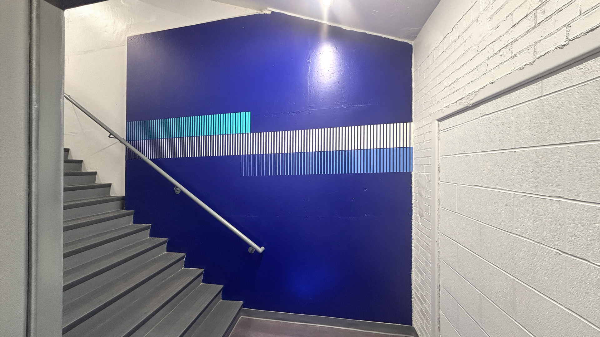
An alternate entrance and exit to the office is located along a stairwell. I used the area as another opportunity to introduce brand color, promotional messaging, and safety-related signage while maintaining a cohesive connection to the primary office environment.
This was a particularly rewarding project because it required turning a large, open office area into a cohesive branded environment through a series of strategically placed visual interactions. The challenge was not simply determining what could be placed on the walls, but understanding the architecture, sightlines, traffic patterns, materials, and scale of the space and determining where each element would have the greatest impact. The project also required careful scheduling and coordination. At the time, I was simultaneously managing the NGAUS and INvestment event projects (see Case Studies 2 and 3), requiring me to balance competing priorities while making time for site measurements, creative development, vendor coordination, production, and installation. The office project was also developed as Phase 2 of the Performance Facility production-floor project, which was still in production. Proprietary requirements, shipping issues, and production challenges added additional complexity and extended the project timeline.
Through coordination with internal stakeholders and external vendors, I was able to manage those challenges and carry the project through to completion. The result was a large-scale workplace transformation that used brand strategically rather than simply decorating the space—creating a cohesive environment that connects Rolls-Royce people, technology, facilities, and brand identity.