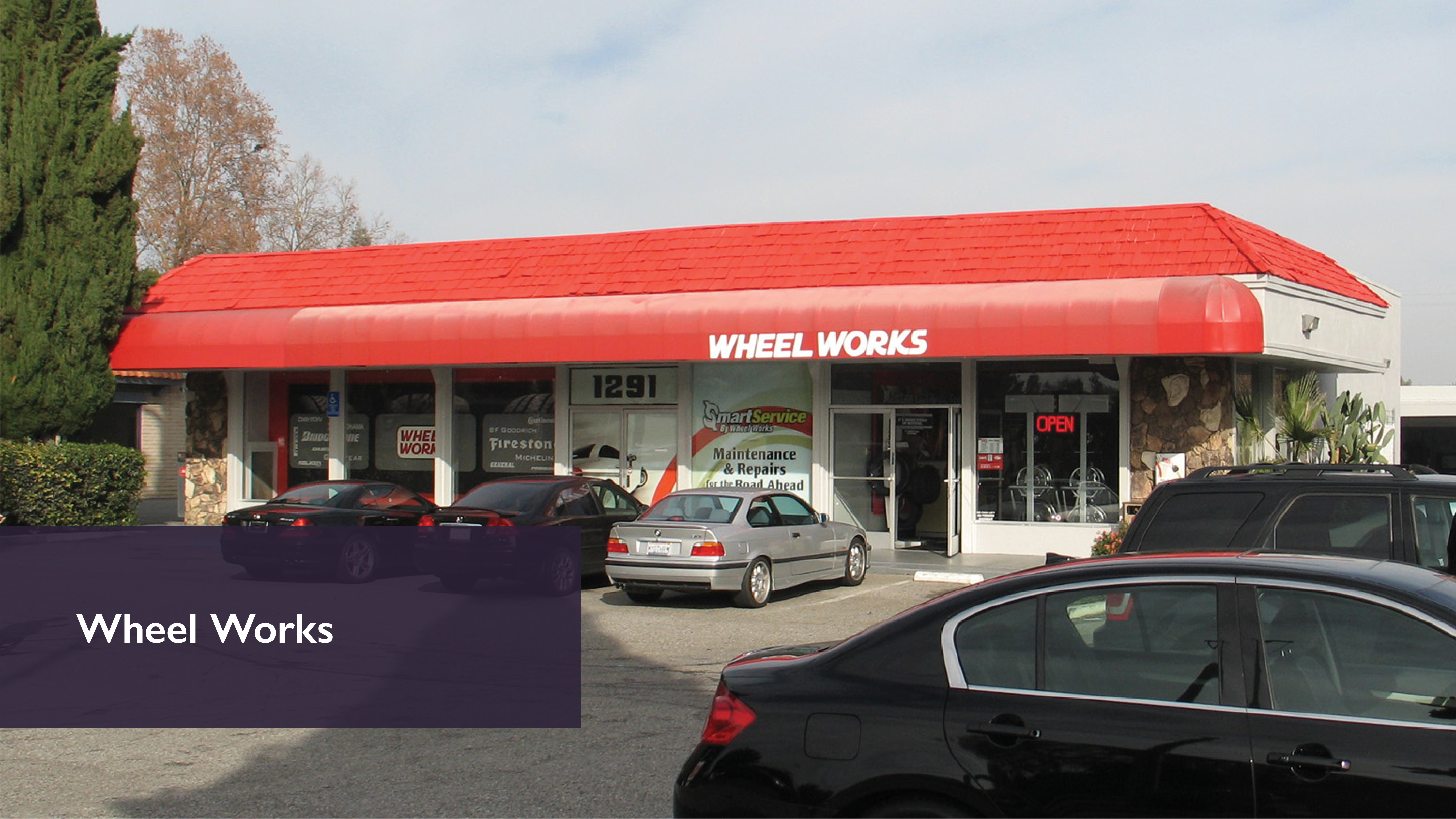
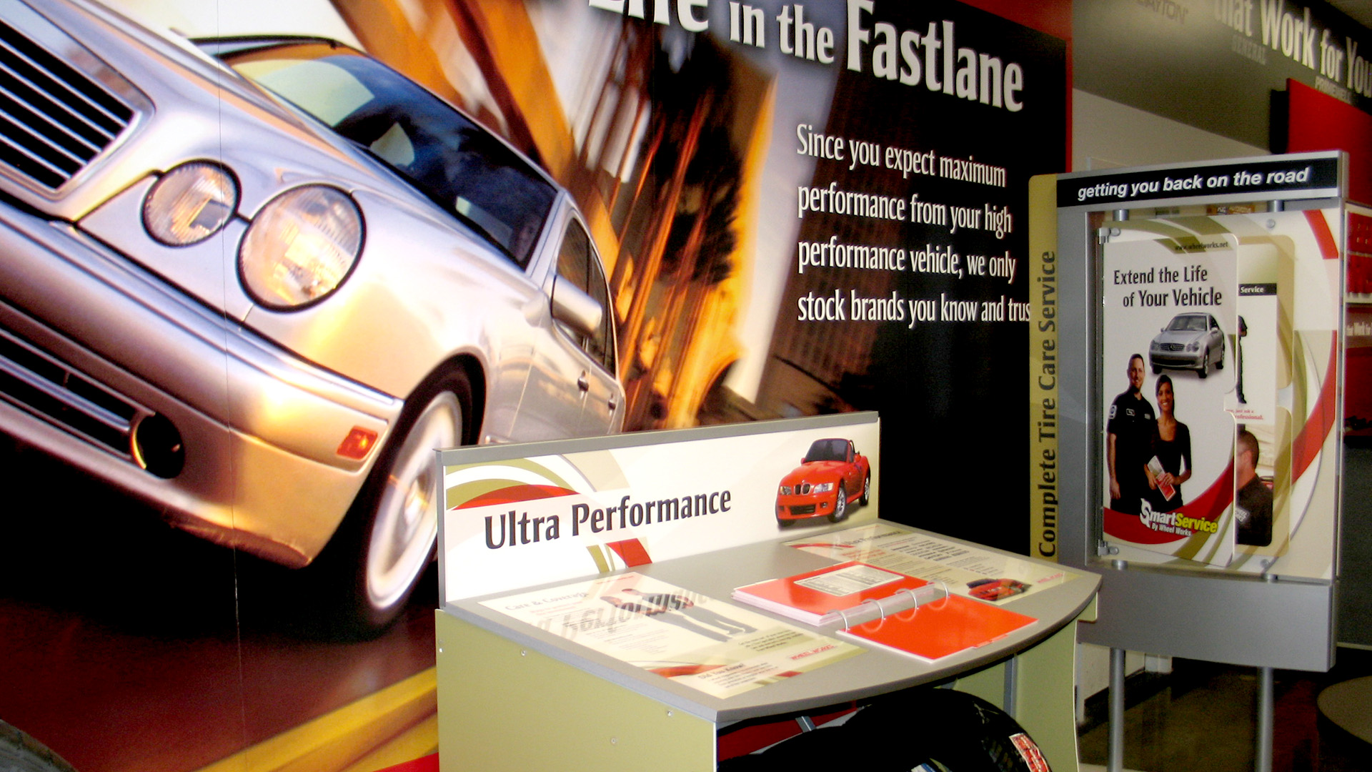
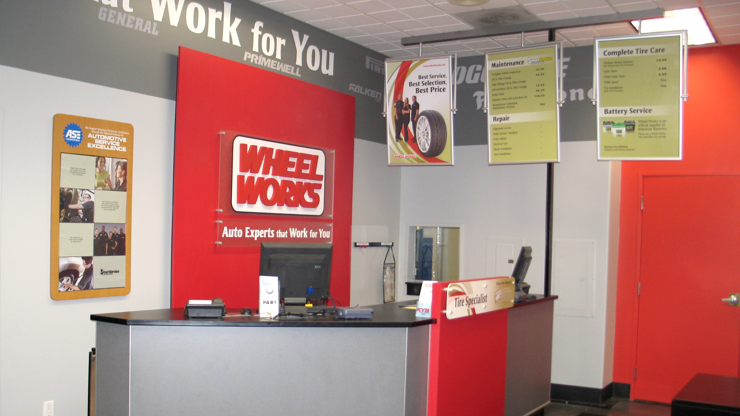
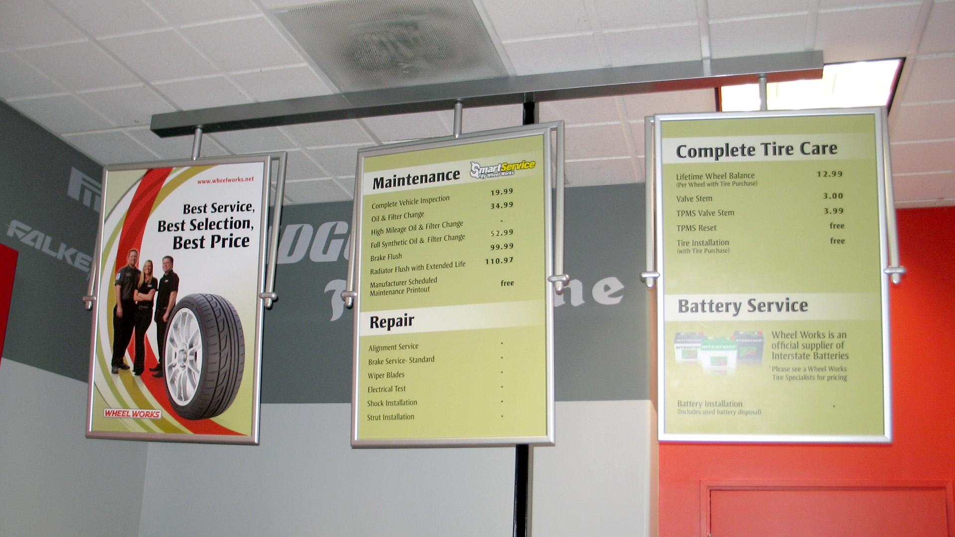
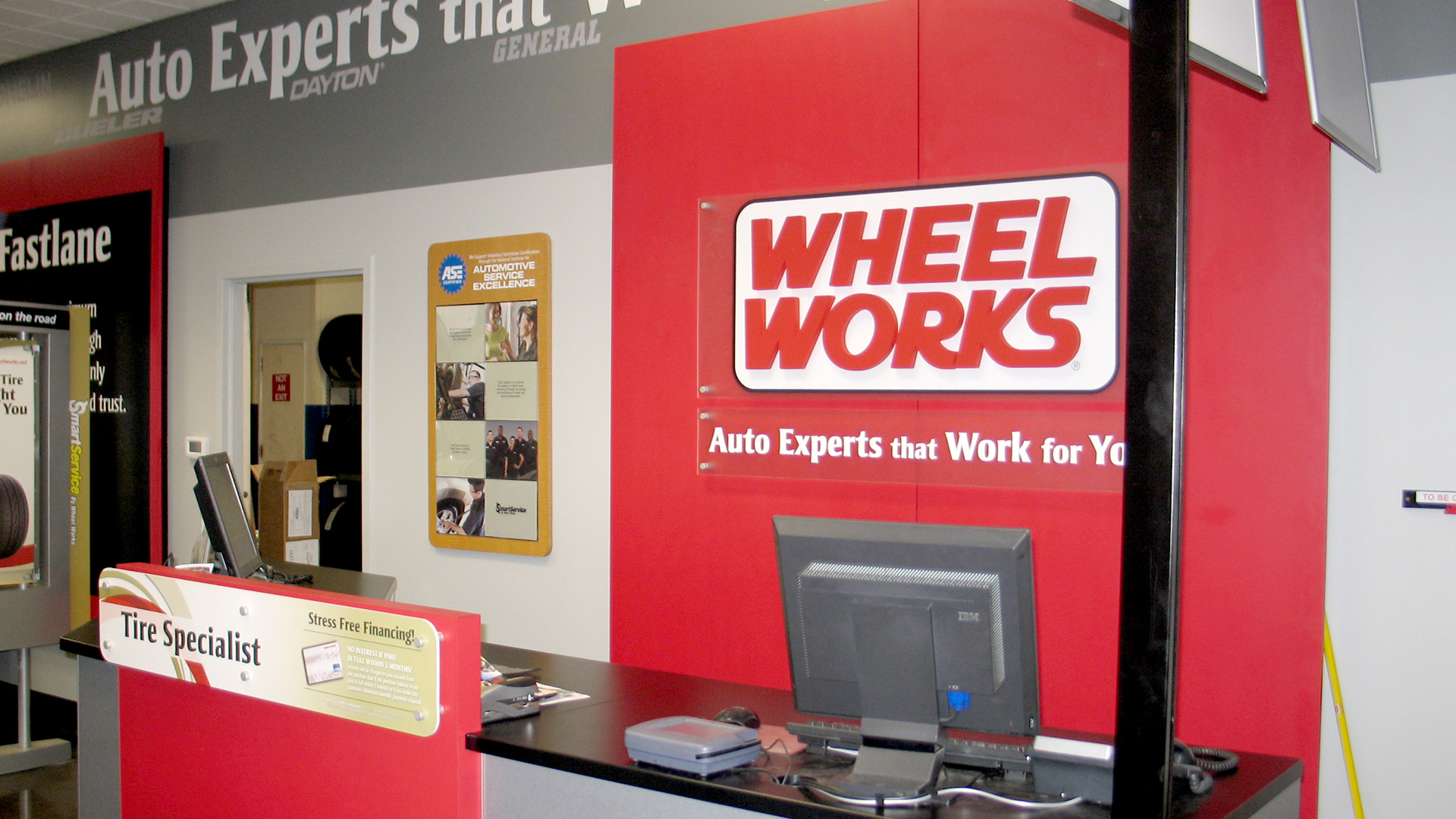
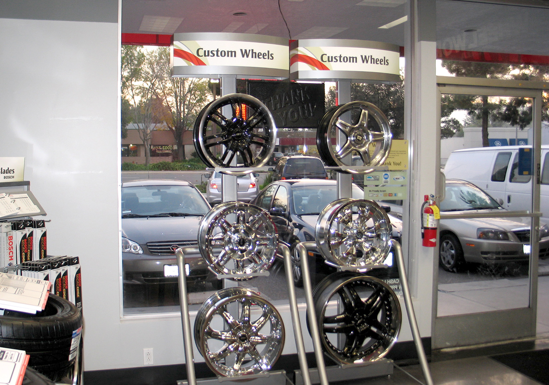
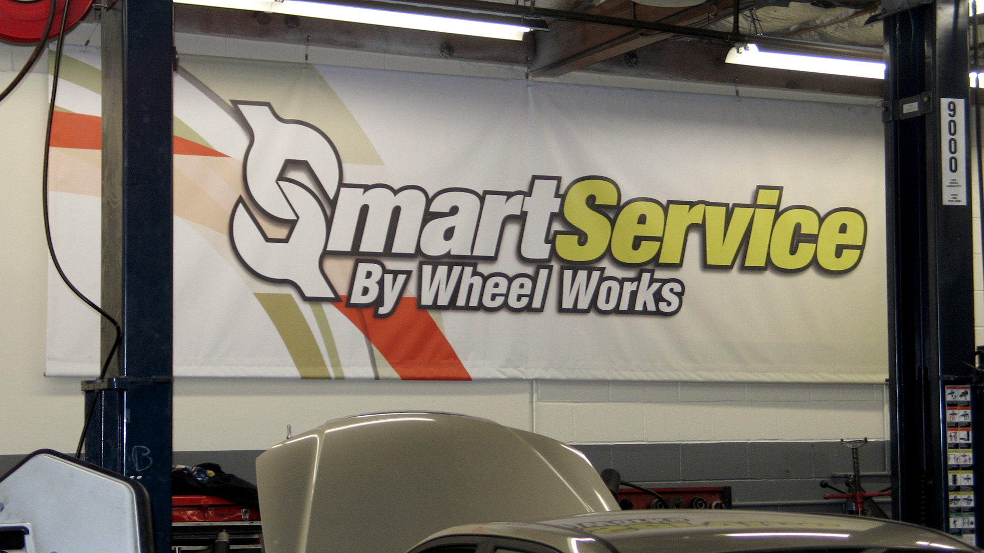
Finally, this is the third auto care store rolled out in mainly the California market. The customer was female, so the color scheme was softer. My director at the time, gave me the idea of adding a third color (light green), which enable me to pull this concept together. The overlaying arcs emulated tire streaks, and created a motif to use throughout the store. The red was used to highlight certain features. Once again, alternate graphics with the same decor, but a completely different interior appeal.